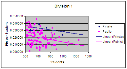
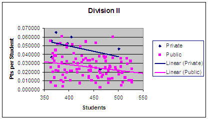
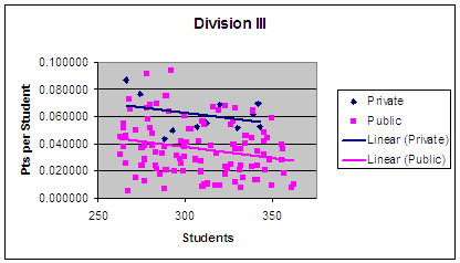
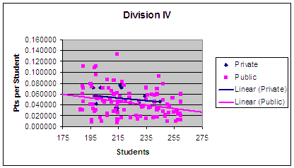
Scatterplots of Students vs. Pts per Student by
Division
Broken into public and private schools
Six Seasons (2000-2005)
|
|
|
|
|
|
|
|
|
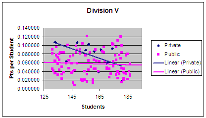
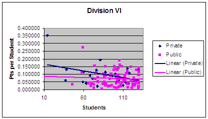
Blue Diamonds are Private School
observations
Magenta Squares are Public School observations
Blue Lines are Linear Regressions based on the
Private School Observations in that Division
Magenta Lines are Linear Regressions based on the Public School Observations in
that Division
Summary of Graphs
The six graphs above are scatterplots of each of the divisions. The x-axis represents the enrollment figure for each school and the y-axis represents the computer points per student for that school averaged over the last six seasons. For example, Mentor (being the largest school in Ohio) can be seen in Division I. It is the only dot with enrollment over 1300. By looking at how high that dot is on the y-axis, we can see how many points per student this school gained on average over the past six seasons. In Mentor's case: around .0175.
There are two lines on each graph. These are regression lines based on public schools and private schools respectively. A regression is a statistical process that attempts to predict the outcome of one observation based on some other observation(s). In this case, the regressions attempt to predict the points per student based on the school's enrollment. By running individual regressions for private and public schools, we can see any differences between the two. For example, in Division I, the public regression line predicts that if a public school has an enrollment of 1300 they will have a points per student score of about .01. However, the private regression line predicts a private school with an enrollment of 1300 will have a points per student score of about .025.
In those charts that show the private school line above the public school line, we can say that private schools are getting more talent per enrolled student than are the public schools. Divsions I, II, and III certainly demonstrate this situation. To a lesser extent Division IV does not have much space between the regression lines indicating there is little of no difference. Divisions V and VI show Private schools outperform for smaller enrollments, but this advantage becomes less as enrollments increase.
The difference between the lines show how great the performance difference is. For example in the Division I example mentioned above, there was a performance difference of just over .01 when the enrollment figure is 1100. The farther the lines are apart, the greater the performace difference.
Interestingly, most graphs have a negative slope. This would indicate that within a division, the larger schools have diminishing returns for each new student enrolled.
Return to Main Page of Public v. Private--Sic Seasons Discussion
Any questions, comments, suggestions, or corrections: e-mail me